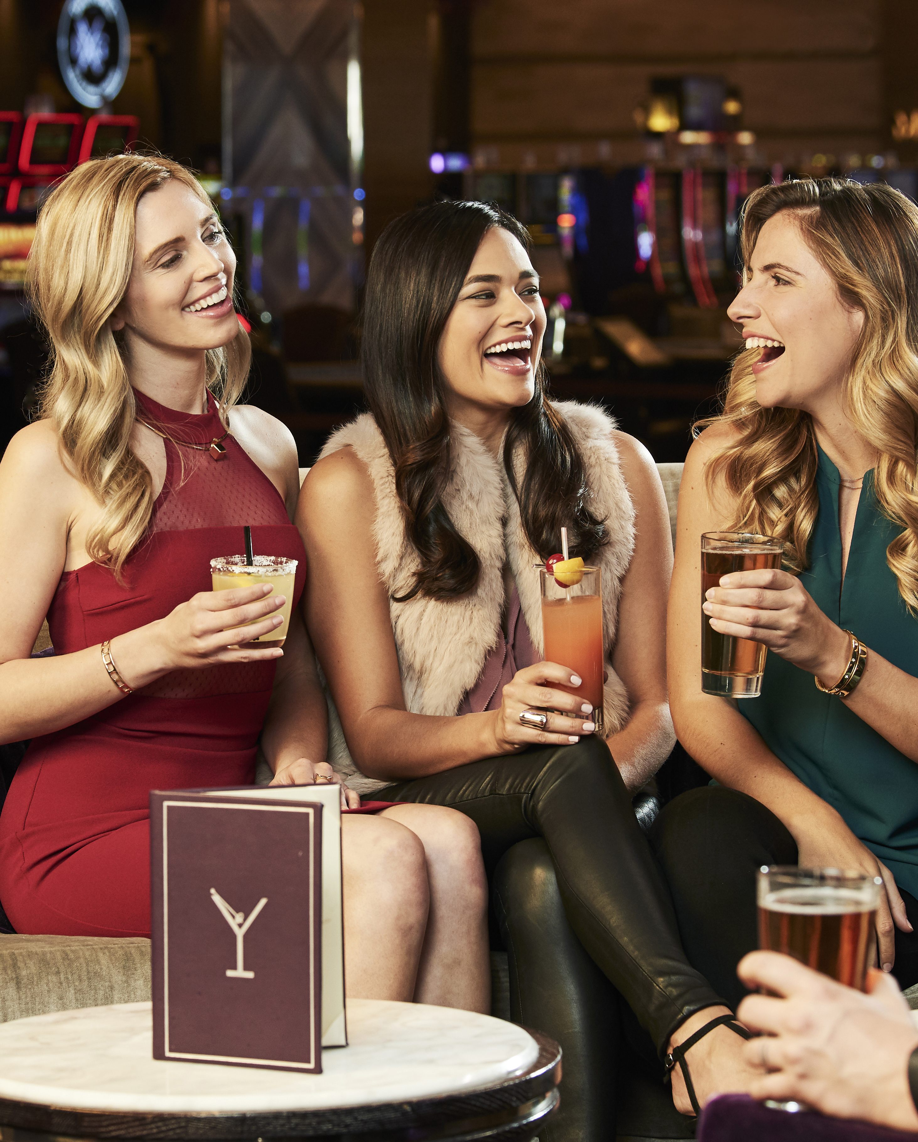
Hello all! I’m so excited to announce the launch of my new website! Check it out!
I’ve taken some time (behind-the-scenes), between photoshoots, client meetings, emails, taxes (whaaaat, what’s that?!) blogging, bookkeeping, being a mommy to an adorable 2-year old, moving houses, being a wife, killing it at Crossfit (haha.. that last part is laughable), keeping up on social media (what’s this stories thing I need to do?)… okay, clearly a lot… to find and curate images that speak to my style, breadth of work, expertise, and experience. I’ve narrowed the galleries down extensively, but hope it gives my viewer (you) a quick and beautiful walk through my work. My passion.
As a professional photographer, understanding, discerning and controlling light is one of the most crucial elements for producing captivating imagery. No matter the subject matter, no matter the project. In the creative world of professional photography, there is an element of subjectivity. Do I want a moody emotion to portray our concept or do I want a bright airy feel to the image? Working closely with creative directors, designers, and clients, understanding the intention of the image and creating a mood and feeling for the audience is the end result, but taking the concept and turning that it in to a tangible product can’t happen without knowing lighting.
Here are a few tips to help understand lighting better. Whether you’re a novice photographer looking to improve your skills, a creative director who would like to better articulate your needs to your photographer, or whether you’re a client looking to understand the photography world a little better, these 3 tips will help.
1. Watch for shadows and highlights.
As you go throughout your day, look at what different light sources are doing. Is your desk lamp creating a hard shadow because it’s a bare bulb? Do your white curtains cause really soft shadows on your couch? Do the patterns from your stairs or blinds cause different shaped shadows? I know, these questions might seem elementary, but as soon as you start recognizing what different types of light sources do to create different types of shadows and highlights, the easier you can start re-creating it. There are many different types of light, which cause different shadows. You can use it to your benefit and alter light with precision. Harsh light with direct shadows, soft light with diffused shadows. These help create a mood. Ask yourself if you want a mysterious image; having harsh shadows with very little detail in the shadow area can help create the right mood. If you want a cheerful image, having little shadows with soft light might help brighten it up.
Strategically placing the light to the side of the subject with little fill light, will help in the drama and emotion of an image.
2. Look through magazines and try to recognize light direction and quality.
When I was being trained at Brooks Institute of Photography, one of my first lighting assignments was to put a binder together of all the different types of lighting (light quality) and light direction. My teacher literally gave me a list of 50 or so lighting demands to fulfill. For example, an image using a 1:4 lighting ratio with the light coming from camera right. Diffused light coming from behind the camera. (Gap Baby uses this technique often). Rim light, butterfly light, Rembrandt etc etc. The list went on. It was amazing. What it did was teach me to see light and all its effects in order to mimic it myself as well as learn the vastness of its uses. I think I even still have the binder, in fact. The quality of light refers to its harshness. Do you want a very soft light or a direct light? If you wanted to photograph an interrogation room, chances are, the light would be from above with a bare bulb. It’s not flattering for a portrait, but it’s emotional and harsh, conveying the appropriate emotion. If you wanted to photograph a Charmin ad, talking about the softness of the toilet paper, soft, diffused lighting would help convey that better. Light direction helps to determine where shadows land as well as what aspects of the subject to highlight. For instance, if I’m photographing food, I want a lot texture, which is not going to be achieved by putting the light right above my camera (on camera flash) or behind me. It might be soft light or hard light, but it won’t get the appropriate look because of the light direction and placement.
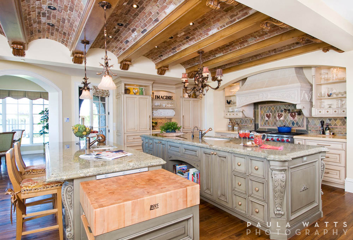
Utilizing light from a specific direction to accentuate the design and connection within the room.
3. Try to be intentional about seeing lighting color temperatures.
Lighting temperature is another way to control your lighting effects and convey the message of your client. There are many different color temperatures, measured by the Kelvin temperature scale. An easy way to describe a basic temperature is warm or cool. If you are photographing an iceberg for Patagonia outdoor gear, you may not decide to put that warming gel on your lights to warm things up. Perhaps, a warm light would be appropriate for a cozy fireplace scene with a glass of brandy. Do you get the distinction? Understanding color temperature and utilizing it or altering it will help create a more concise message in the photograph. Not to mention appropriate color balance. In addition, there are always lights in various locations that a photographer will need to balance or work around. For instance, overhead fluorescent lights do not create flattering light for a portrait. If you need to photograph an executive in a boardroom, however, learning to either work around the fluorescent tube, overpowering the green-tinted light, or putting a gel over the light will be a necessary decision for the photographer to make. Balancing color temperature is necessary in order to avoid having a green tinted CEO, looking sick to the stomach.
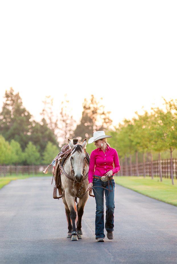
My client wanted a warm and soft image to show the connection between the horse and trainer to emphasize their branding which involves a nostalgic warm appeal.
In short, I can’t stress enough how important knowing and controlling light truly is for photographers, or for choosing a knowledgeable photographer for your next project. If you have any questions or would like to keep this discussion going, please feel free to comment below. It’s kind of a passion of mine, and would love to “geek” out with some more lighting talk.
//Want to see more on lighting? Check out this previous post with a cool before/after : lightingmatters
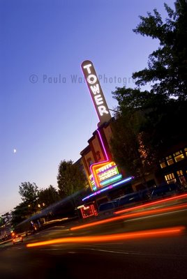
After being gone for so long, coming home to Bend makes me really appreciate sights and places that before I took for granted… like the Tower Theater. So, last night, I decided to stop and take a closer look and even snap a few shots for the ole’ stock portfolio.
Another shoot I did for Bend Living Magazine recently was photographing their Grand Finale sections- which is basically an image accompanied by the recipe. Here’s two I shot! Mmmm…
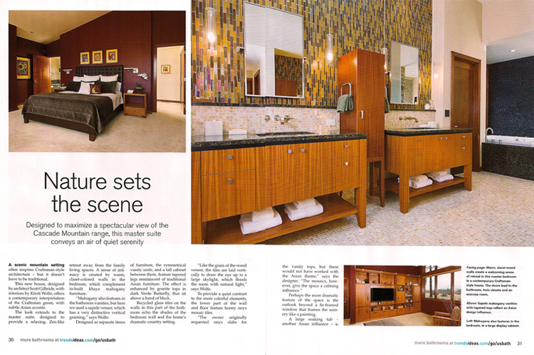
I am very fortunate to have architectural clients that produce such wonderful work! Last year, I photographed the Mathew’s residence in Shevlin Commons, here in Bend Oregon for clients, Kirsti Wolfe Designs, Scott Gilbride Architect, Dansky Handcrafted, and Greg Vendrame Construction. It was recently published twice in Trends Magazine, once seen below, and once in my last blog post. This home is not just beautifully photogenic (and it is), it is quality and style through and through. This home is modern elegance with a mountain view and I thoroughly enjoyed photographing it. The pleasure and honor to be published in Trends because of this home is all mine!
Tucked away in a fairytale village far, far away lived a queen and king… okay, so we’re not really in a fairytale, but this home has all the charm to make someone feel like it.
The architecture models the feel of a late 1800’s Jane Austin novel with modern amenities and living spaces. From movie theater to kitchen nook solarium, to Biblical stones laid in the wine cellar, from library to spiral staircases and mountain views, covering 16,000sq ft., Harrison Design Associates designed the home and didn’t leave out a single detail.
It was an honor and pleasure to photograph this beautiful residence.
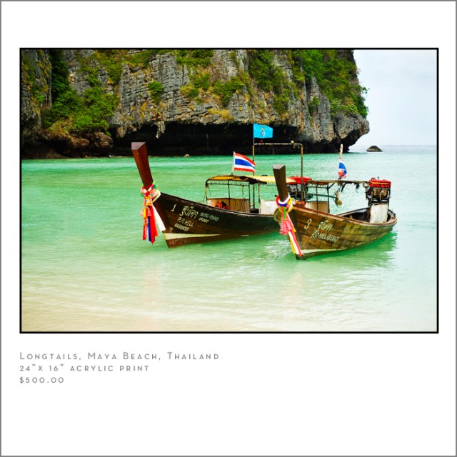
Well, if you missed the big opening of the World In Color Photographic Gallery, you still have a chance to check out the art work. Not only is it hanging the WHOLE month of October at the Dyna Art Lounge in the Pearl District of Portland, I am also featuring the work right here on my blog. (although you truly can’t understand the beauty of an acrylic print until you see it in person). The gallery is open Mon-Fri, normal business hours and is located at 300 NW 14th Avenue, Portland, OR. The gallery is inside the Dynagraphics building, so go take a peak inside!
For special orders or purchasing details, please contact me directly at info@paulawattsphoto.com.
This gallery is something that has been such a journey for me and my husband. Not only did we spend 6 months last year traveling the world, photographing our hearts out, we have really been trying to find out what the best way to share the imagery is and hopefully impact people along the way. When I was given this gallery opportunity, I knew it would be the right step in the right direction. I long for people to see these images not only as beautiful pieces of art but also as a way of appreciating other cultures and hopefully spuring on a desire to travel to all corners of the world. I feel that only then can people truly understand the need that is so evident in places like Africa and India and finally realize our place in helping. This gallery is meant to be a call to action. Whether the first step is learning more about a place, a foreign land that might put us out of our comfort zone, or a place that our heart longs to visit. The world is small. We can help one another.